Apple's Liquid Glass: When aesthetics beat function
If you’re a designer and you haven’t heard of Apple’s Liquid Glass yet, either you’ve been offline for weeks or you just don’t care. Either way: I envy you.
Apple recently announced Liquid Glass at WWDC 2025—their new transparent design system for all operating systems. Once again, aesthetics beats function. These interfaces have obvious readability issues that Apple’s own design standards should have caught.
I watched the initial presentation during WWDC 2025. My initial thought was: they’re getting people used to transparent UIs for spatial computing (mixed reality environments where digital interfaces blend with the physical world). My immediate second thought was, ‘wow, you can’t read a thing - are they serious?’.
Skeuomorphism done right (and wrong)
Designers have always borrowed from the real world, though these metaphors often outlive their origins. The universal save icon? Still a floppy disk, even though entire generations have never seen one. Attaching a document? A paperclip. Delete something? Trash can.
These started as clear functional metaphors, but many have become purely learned conventions. We know what the save icon means not because we work with floppy disks, but because we’ve been taught this symbol equals ‘save.’
Apple’s been a pioneer for this, especially on mobile where touchscreen interfaces were entirely new to users. Earlier computing had already established foundational metaphors—the desktop with folders and a trash can, documents and filing systems. But Apple took this further on mobile. The iBooks design? Representing a bookcase. Notes looking like a yellow legal pad. Contacts as an address book. Calendar with leather binding.
Skeuomorphism served a real purpose when computing was new. These visual metaphors helped users understand unfamiliar digital concepts by connecting them to familiar physical objects. The trash can for deletion, buttons that looked pressable—these weren’t just decorative choices. They solved actual usability problems by providing clear functional metaphors.
So it’s no surprise that Apple is doubling down on transparency for their new design system. Transparency in spatial computing makes sense—digital UI that’s not too in-your-face, intertwined with the real world. I can see the appeal of that future.
The problem isn’t that transparency is inherently bad design. In the right context, it works beautifully. The issue is when design decisions prioritize how something looks over how it actually functions. This is where things get problematic. And that’s exactly what’s happening with Liquid Glass on traditional interfaces.
Consistency at what cost?
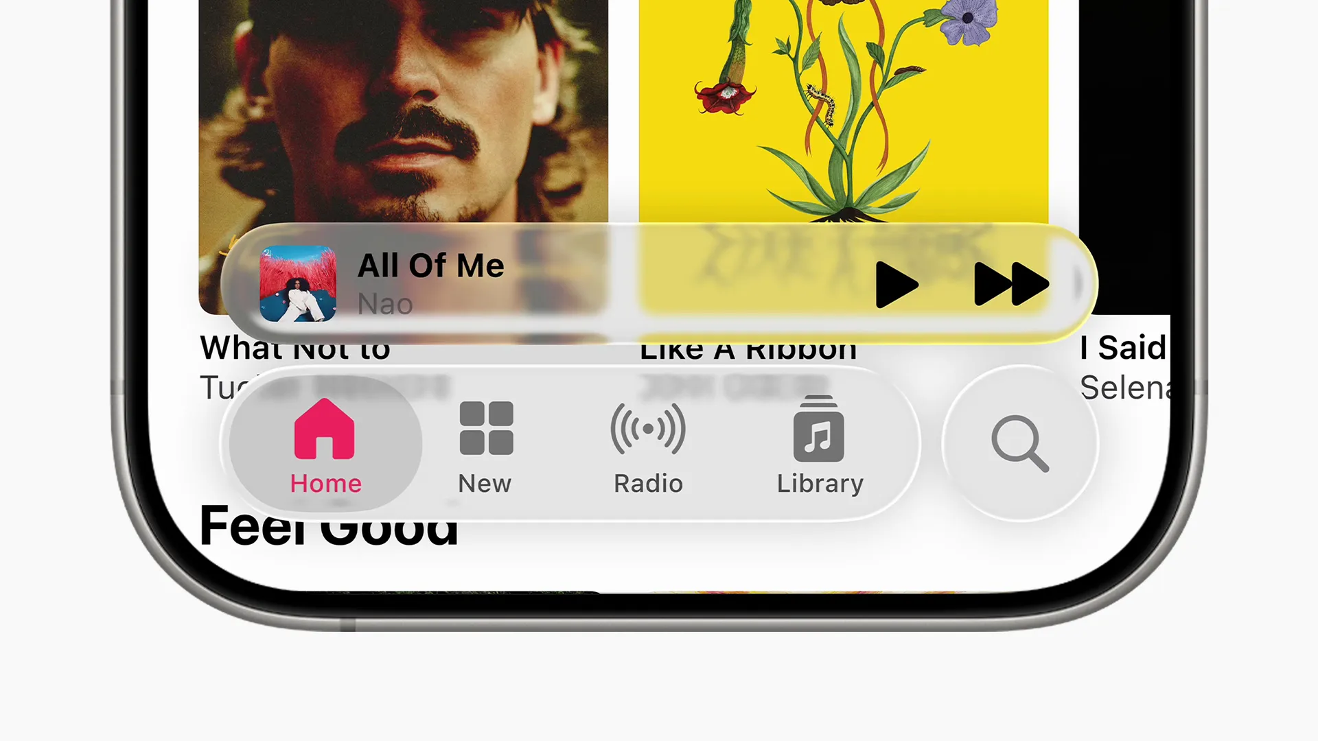
The problem with Liquid Glass isn’t transparency itself. It’s that Apple is prioritizing visual consistency over readability. While this creates visual unity, it diminishes usability on traditional interfaces where transparency serves no functional purpose. Look at the screenshots: text becomes harder to read when layered over busy backgrounds. Interface elements blend together. What should be clear visual hierarchies become muddled.
I understand why Apple wants this consistency. Unified design languages across platforms make sense and can improve usability when done right.
However, I feel that the gains of consistency are far outweighed by the diminished readability. And I’m sure Apple knows it. So is this just another example of the familiar tendency in design where aesthetic decisions override functional ones?
Take modern car dashboards. The shift from physical knobs to touchscreens looked more premium and modern, but buried perfectly functional controls in digital menus that require you to look away from driving and thus making cars less safe to operate.
Apple’s doing something similar with Liquid Glass—applying a design system optimized for spatial computing to traditional interfaces where consistency creates problems rather than solving them.
Spatial computing as an exception
Transparency works in visionOS where you need to see your physical surroundings for safety and spatial awareness. It also maintains immersion, as transparent interfaces feel like looking through glass while staying present in your physical space.
But here’s the key difference—even visionOS transparency comes with major caveats. Apple’s design guidelines require increased font weights and warn developers about stacking transparent materials because it impacts legibility and reduces contrast. This spatial computing rationale doesn’t translate to traditional 2D interfaces.
On phones and computers, transparency serves no safety function. Instead, it introduces readability problems without any of the spatial computing benefits.
Apple’s Liquid Glass may win design accolades, but history suggests it will join the long list of beautiful solutions that made computing harder, not easier, for the people who actually have to use it every day. Unless they get it right.
Early signs suggest they’re already realizing this. Later iOS 26 beta releases show Apple reducing transparency and adding blur effects for better readability.
Just like car manufacturers are now discovering as they bring back physical controls. Sometimes the old knob worked better than the shiny new touchscreen. The digital interfaces we interact with daily deserve the same consideration: function over form, every time.
Design isn’t just about aesthetics—it’s about function. When design fails, we feel immediate frustration, even if we don’t recognize it as a design problem. These moments aren’t just annoyances—they’re design failures, symptoms of a deeper problem. Each represents a failure of design thinking, where creators lost sight of the actual humans who would use their products and systems.
Discuss on Hacker News