How to turn getting water into rocket science
Feb 10, 2025 by
Max van IJsselmuiden
This is part of my ongoing series exploring frustrating user experiences we encounter in everyday life. These real-world UX failures show how design thinking (or lack thereof) forgets common sense.
A coworker dared me to try our new office water boiler. The assignment: make a cup of tea. Challenge accepted!
Walking up to the boiler, I noticed its clean, ‘modern’ design.
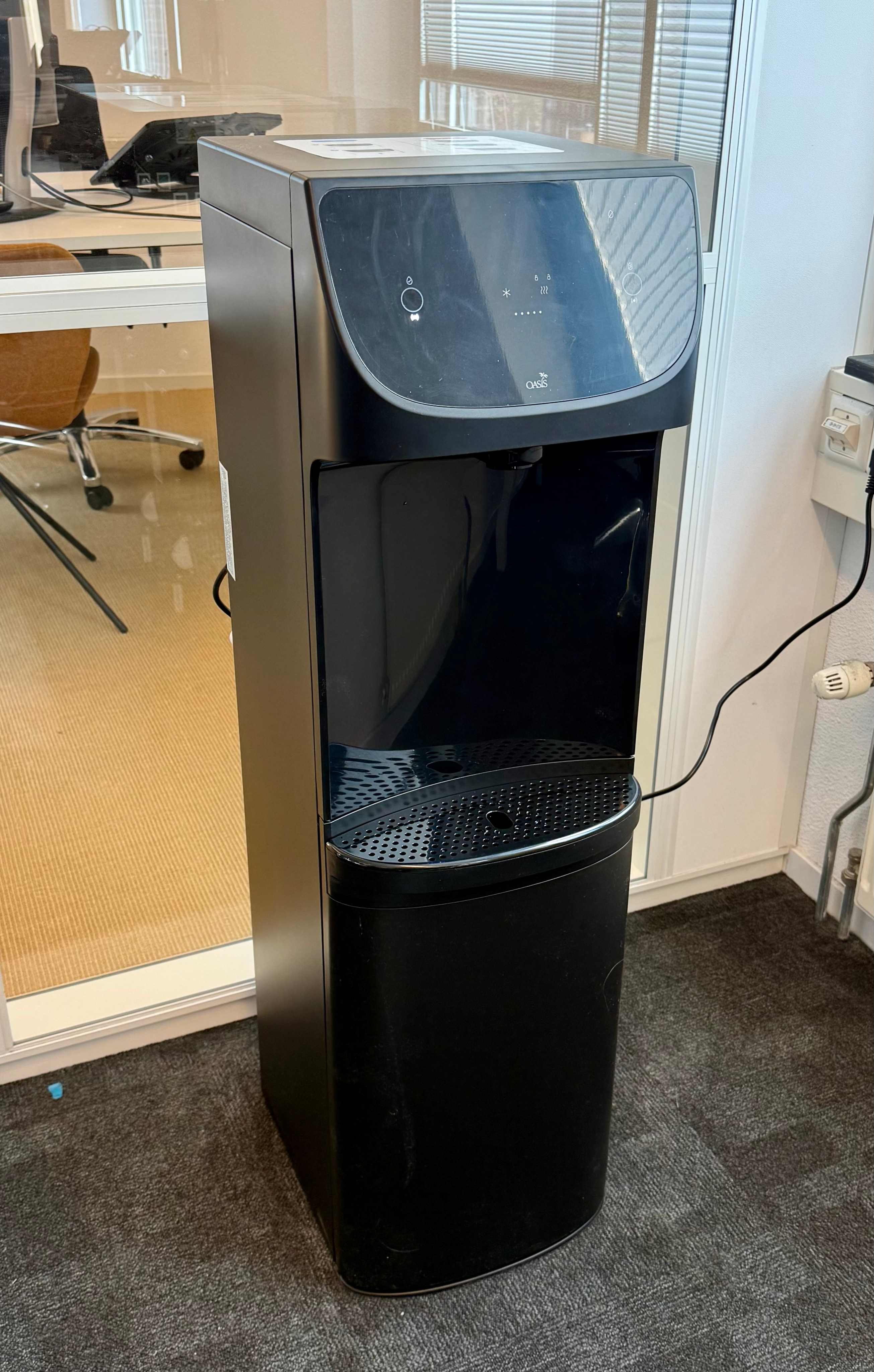
Image: Max van IJsselmuiden
I started to take a critical look at the buttons: on the left, a water droplet with a checkmark; on the right, a water droplet falling into a cup. Both must activate water… somehow? In the middle of the ‘display’ there’s a ‘cold’ symbol and a ‘hot’ symbol with a few dots below it. This section must indicate how hot or cold the water output is.
I pushed the left button—water spits out in the middle! Not where I expected my cup to go.
I tried the right button—same result. And the water didn’t seem to be hot.
Confused and dazed, I noticed that on top of the water boiler there’s a sheet with visual explanations. A manual! This is great. This will help me perform my task of making tea.
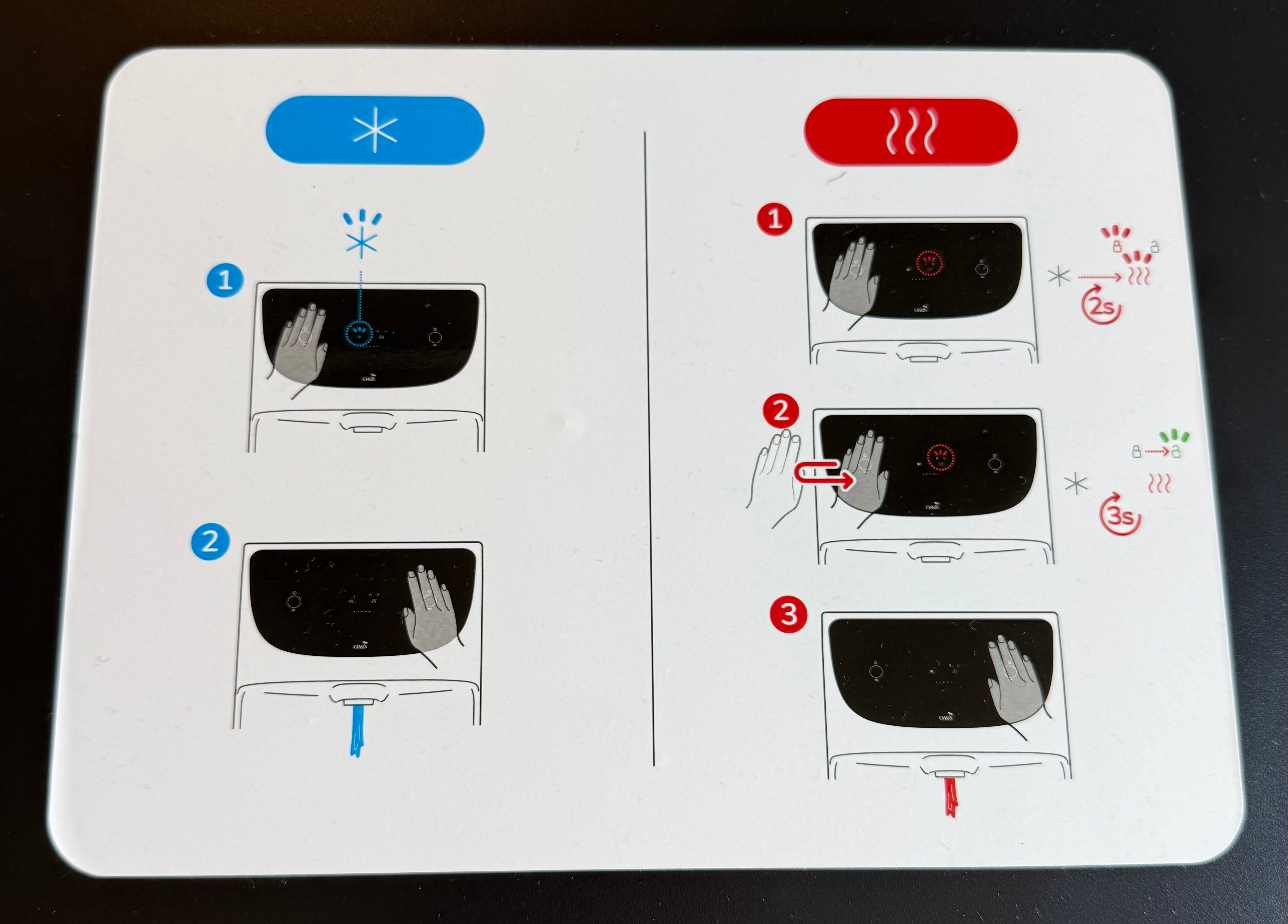
Image: Max van IJsselmuiden
The manual showed the left side for cold water, right side for hot.
Step 1: hover your hand over the left side.
I’ve done that before, but then pressed the button. Let’s try it without pressing.
I hover my hand over the left side, nothing really happens. I notice a lock symbol with ‘2s’—apparently it takes two seconds to unlock. I hover for two seconds. The lock ‘charges up’ in the middle but stays red and locked.
Step 2: move hand left-to-right to unlock the hot water (I think?).
I hover for two seconds, the lock charges, then I move my hand left to right. The lock turns green! It works!
I was so happy that it worked that I forgot to actually use the hot water. I waited too long, and it seems I have to redo everything again.
Step 3: hover hand over the right side.
After performing all the steps I just learned, hot water finally emerged! I remembered from the beginning that the cup was supposed to go in the middle, so I caught the hot water. I’ve still got a bit of the cold water in my cup from my previous attempts.
A lukewarm tea it will be for now.
I’ve spent the next fifteen minutes just thinking about all the processes that have come to this solution for a water boiler. What would be the advantage of this interaction? Potentially, not having to touch the device to interact with it (you’ll feel like a wizard), and thus not having to clean it. Is that advantage really worth all this trouble?
For simple tasks like these, there’s something wrong with the product design if you need the manual to be able to operate it.
Update July 20, 2025: This exact water boiler in the office has been replaced by an older model. You guessed it: the one with buttons.
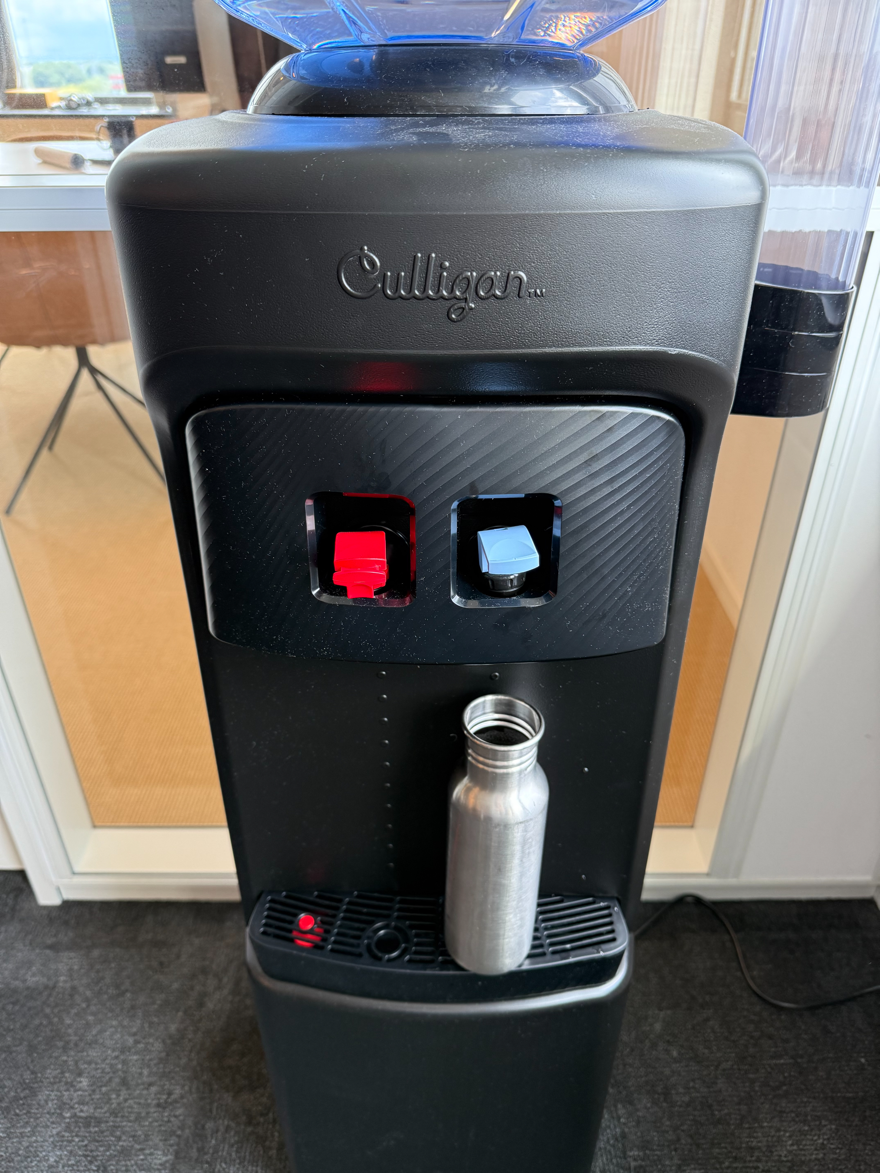
Image: Max van IJsselmuiden
Design isn’t just about aesthetics—it’s about function. When design fails, we feel immediate frustration, even if we don’t recognize it as a design problem. These moments aren’t just annoyances—they’re design failures, symptoms of a deeper problem. Each represents a failure of design thinking, where creators lost sight of the actual humans who would use their products and systems.
Did you like this post?
Newer
July 20, 2025
Apple's new Liquid Glass design system prioritizes aesthetics over usability, creating beautiful but hard-to-read interfaces that repeat the same mistakes as touchscreen car dashboards.
Older
March 30, 2025
A simple visit to a university professor becomes a 20-minute navigation nightmare through poorly signed hallways and confusing room numbering systems. A perfect example of institutional design that prioritizes administrative logic over human wayfinding needs.
Want to stay tuned?
How to turn getting water into rocket science
February 10, 2025 by
Max van IJsselmuiden
This is part of my ongoing series exploring frustrating user experiences we encounter in everyday life. These real-world UX failures show how design thinking (or lack thereof) forgets common sense.
A coworker dared me to try our new office water boiler. The assignment: make a cup of tea. Challenge accepted!
Walking up to the boiler, I noticed its clean, ‘modern’ design.

Image: Max van IJsselmuiden
I started to take a critical look at the buttons: on the left, a water droplet with a checkmark; on the right, a water droplet falling into a cup. Both must activate water… somehow? In the middle of the ‘display’ there’s a ‘cold’ symbol and a ‘hot’ symbol with a few dots below it. This section must indicate how hot or cold the water output is.
I pushed the left button—water spits out in the middle! Not where I expected my cup to go.
I tried the right button—same result. And the water didn’t seem to be hot.
Confused and dazed, I noticed that on top of the water boiler there’s a sheet with visual explanations. A manual! This is great. This will help me perform my task of making tea.

Image: Max van IJsselmuiden
The manual showed the left side for cold water, right side for hot.
Step 1: hover your hand over the left side.
I’ve done that before, but then pressed the button. Let’s try it without pressing.
I hover my hand over the left side, nothing really happens. I notice a lock symbol with ‘2s’—apparently it takes two seconds to unlock. I hover for two seconds. The lock ‘charges up’ in the middle but stays red and locked.
Step 2: move hand left-to-right to unlock the hot water (I think?).
I hover for two seconds, the lock charges, then I move my hand left to right. The lock turns green! It works!
I was so happy that it worked that I forgot to actually use the hot water. I waited too long, and it seems I have to redo everything again.
Step 3: hover hand over the right side.
After performing all the steps I just learned, hot water finally emerged! I remembered from the beginning that the cup was supposed to go in the middle, so I caught the hot water. I’ve still got a bit of the cold water in my cup from my previous attempts.
A lukewarm tea it will be for now.
I’ve spent the next fifteen minutes just thinking about all the processes that have come to this solution for a water boiler. What would be the advantage of this interaction? Potentially, not having to touch the device to interact with it (you’ll feel like a wizard), and thus not having to clean it. Is that advantage really worth all this trouble?
For simple tasks like these, there’s something wrong with the product design if you need the manual to be able to operate it.
Update July 20, 2025: This exact water boiler in the office has been replaced by an older model. You guessed it: the one with buttons.

Image: Max van IJsselmuiden
Design isn’t just about aesthetics—it’s about function. When design fails, we feel immediate frustration, even if we don’t recognize it as a design problem. These moments aren’t just annoyances—they’re design failures, symptoms of a deeper problem. Each represents a failure of design thinking, where creators lost sight of the actual humans who would use their products and systems.
Did you like this post?
Newer
July 20, 2025
Apple's new Liquid Glass design system prioritizes aesthetics over usability, creating beautiful but hard-to-read interfaces that repeat the same mistakes as touchscreen car dashboards.
Older
March 30, 2025
A simple visit to a university professor becomes a 20-minute navigation nightmare through poorly signed hallways and confusing room numbering systems. A perfect example of institutional design that prioritizes administrative logic over human wayfinding needs.
Want to stay tuned?
