Just let me in, please
As a product designer, I can’t help but recognise frustrating design decisions in the software that I use. For the past year or so, one of my biggest frustrations has been the way we now authenticate online.
Over the past few years, we have moved on from a simple email and password, introducing several ‘improvements’. I understand that most of these improvements are for ‘ease of use’ or ‘increased security’. The problem is that ‘ease of use’ can actually mean more friction, not less, and above all, we are not given a choice.
One field at a time
Many login forms now only show the email field first. We enter our email, press ‘continue’, and see if we passed the first test. Then comes the second test: password, verification code, magic link?
I understand how we got here. Some of us need a company login, some don’t have a password at all, and the form can’t know which until it knows who we are. But it still frustrates me every single time.
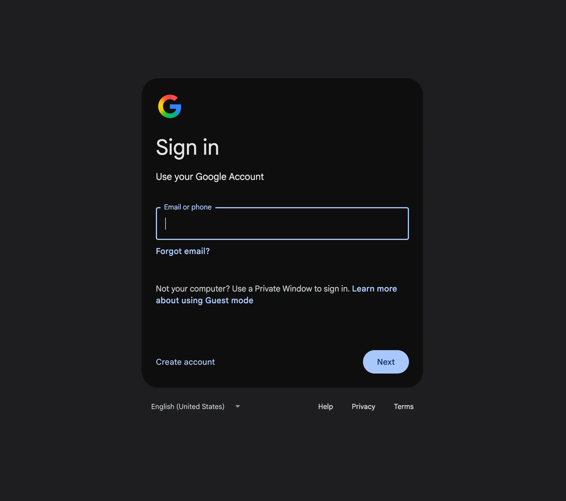
Check your inbox
After filling in our email, we have to check our inbox. While this is presented as ‘ease of use’, in reality we wait for the email, open our email client (and perhaps authenticate there too), and wait for it to load. Open the email, copy and paste the code, or click the link.
I see the appeal: no password, no security issue. Leave the security to the email provider. Unfortunately, my inbox is now full of these emails. The advantage of a password manager goes out the window. Essentially, every login is not too far off from a password reset.
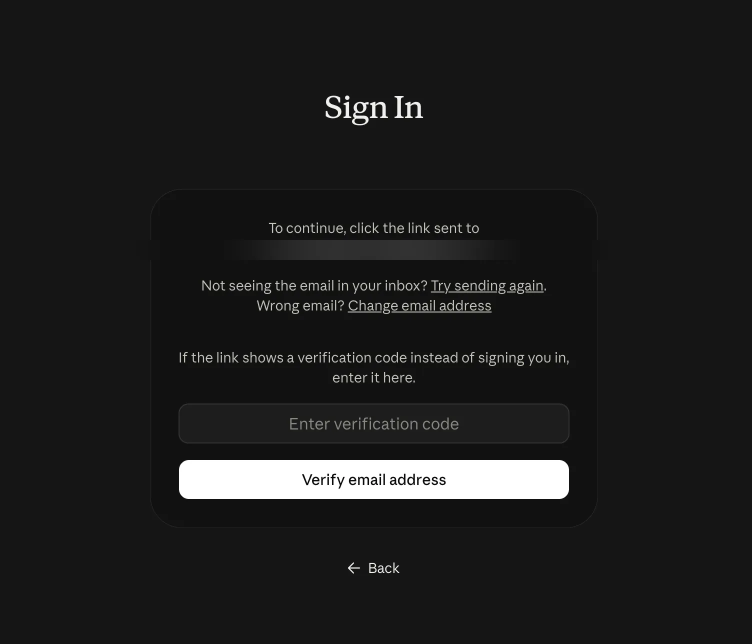
Just let me choose
Most of the time I just want to use my password to log in. I’ve got my password manager to take care of my security. When I can, I set up a passkey, making signing in incredibly quick and easy for me.
Instead of forcing us to fill in our email address first and guess what will happen next, present us with an option, assume that we already know how we want to log in.
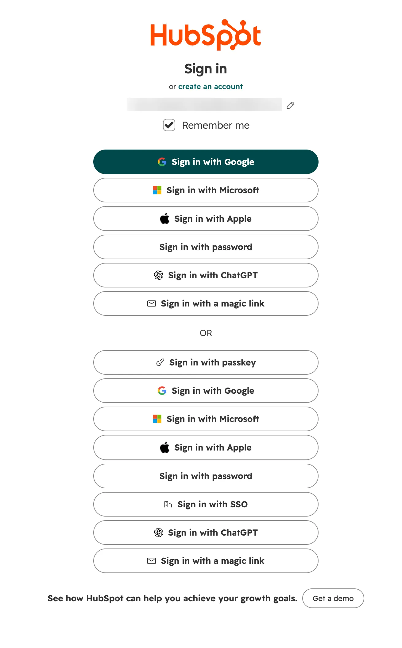
Now of course, you can overdo this.
Where was I going?
And lastly, most systems seem to forget where we were trying to go in the first place.
Sometimes we follow a link someone shared — a document we collaborate on, for example. More often than not, after signing in, we’ve arrived on a generic dashboard. We have to go back to where we got the link and try again.
Please make sure to send us to the right place.
After all, the authentication method should just solve the problem: taking us where we want to go, securely.
Discuss on Hacker News