Stop adding touch screens to everything
Touch screens are everywhere, and have been for a while. They are great, versatile, intuitive. They are also, in some scenarios, making the interaction worse than what they replaced.
It’s directly conflicting with a principle that I’ve been working on in what I call common sense design. The most relevant principles state ‘design is solving a problem, choosing who it’s for, and knowing context’.
In some scenarios, there was no problem to solve in the first place.
The default
Look, I get it. We’re excellent at making 2D interfaces. The screen became the answer to every interface problem. Flexible, updatable, and by now most likely cheaper to manufacture than a custom physical product. It’s a business decision dressed up as a design decision.
Don’t get me wrong, I’m not anti-screen. In most scenarios, the touch screen interaction works great. We’ve all gotten used to it. It’s so intuitive that kids know how to interact with it straight out of the womb. When there are no environmental constraints, such as a potentially stressful environment, screens will do just fine.
When it breaks
It’s the environmental constraints that make a touch screen interaction break fast. Let’s start with a simple personal example.
My air fryer has got touch buttons. The problem is, you can’t see them when they are turned off. The touch area is a black piece of plastic. No indication what to do.

The first time I had to use it, I had to ask a family member.
I’m no idiot, surely I can turn on an air fryer. After some trial-and-error and pressing a spot in the middle of the plastic area, the air fryer turned on.
Coffee machines, refrigerators, stovetops, ovens. Hotel thermostats. Gym treadmills. Apple’s Touch Bar… They all have the same issue: they’re not solving a problem for the user.
Sometimes the older interaction is the better one. Sometimes, we don’t need change.
Why we keep doing it
But why does this keep happening? My thinking: greed and laziness. Greed: upselling and cost reduction. Laziness: because it is the default solution — to benefit from newer technologies, simply add a screen.
Let’s look at where this is happening and why.
Greed
The first reason, as always, comes down to money. Think about manufacturing simplification, software updatability and upsell funnels.
A good example: standardized ordering kiosks. These kiosks enable consistent and testable upselling techniques without paying an employee. The human is taken out of the equation. Sure, faster in some scenarios, but was that the problem?
At least keep a human option as backup.
Side story
This story is from a couple years ago. I still remember it vividly. About to board a ferry, we had about 20–30 minutes to spare. The waiting room was relatively quiet, and I was into a coffee.
I looked around and noticed a Dunkin’ Donuts in the building. There weren’t many people.
I walk up to the counter. The cashier seems to be surprised that I walked up to her. I ignored the surprised look and decided to just mention my wishes: one black coffee please.
“Ah, could you please order at the screen?”
She points at an area behind me. There’s a touch screen kiosk.
I refused. “Can I just order one black coffee, from you, please?”
“I’m sorry, I can only accept orders when they are taken from the touch screen.”
The screen has an overload of information, colours and advertisements. It must have taken me at least 10–15 touches to be able to order a single coffee.
“Would you like this with your order?” No.
“Are you sure?” Yes.
“Did you like this interaction?”
No.
Laziness
Secondly, it comes down to laziness. The touch screen is the new default for all scenarios.
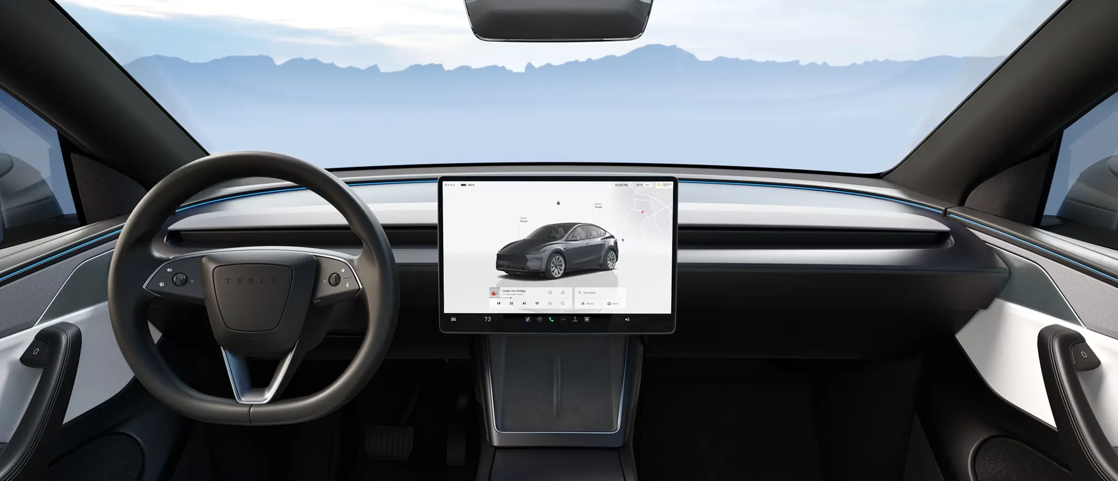
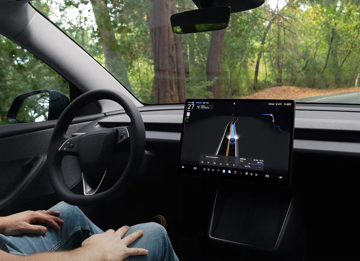
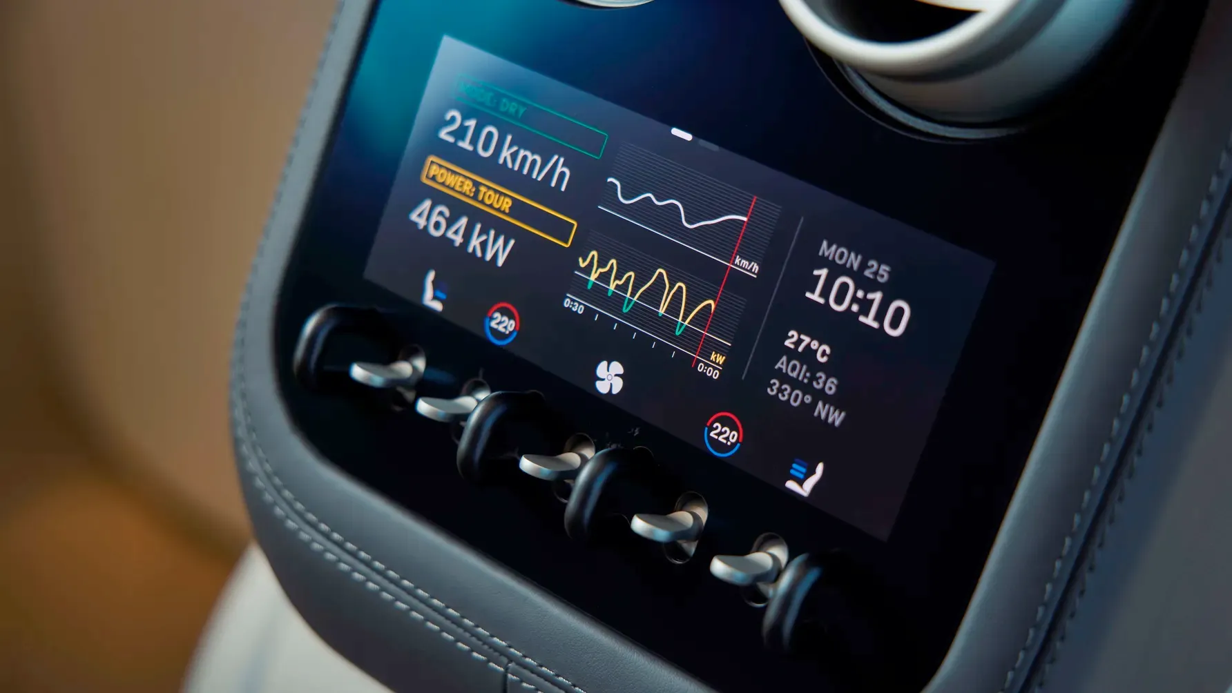
The car industry is the perfect blend of both: greed for the cost savings, laziness for skipping the harder design problem. It’s also the most troubling scenario, for me.
It’s the industry where it is obvious that a touch screen is a dangerous choice. A touch screen requires you to look where your finger lands. It takes more time and is more distracting than the previously common physical buttons.
Interfaces that require visual confirmation are fundamentally incompatible with driving.
There have been many accidents caused by distracted drivers. Despite it being difficult to pinpoint whether these accidents were caused by touch screen interaction, the facts are there: the touch screens take longer to interact with.
Results of a test performed by Sweden’s biggest car magazine: Vi BilägareThe driver in the worst-performing car needs four times longer to perform simple tasks
Research indicates that performing in-car touchscreen tasks can be just as hazardous as using a mobile phone while driving. The same source says that 97% of cars released after 2023 feature a touch screen.
Fatal Accident ClaimsSimple tasks, such as adjusting lane assist or tuning the radio, took drivers up to 22 seconds to complete.
The European Transport Safety Council reports a warning on infotainment screen distraction, quoting: ‘In-car touch screens are extremely detrimental to driver attention according to new research carried out for Trygg Trafikk (the Norwegian Council for Road Safety).’
Tesla even went as far as moving the shifting controls to the touch screen. Truth be told, you can still switch using physical buttons in the overhead console, but it’s a clear indication of the company’s intentions.
Back in 2019, Nielsen Norman Group published a critical take at Tesla’s touch screen, admitting that there are advantages and highlighting the main flaw: poor target design. Their conclusion:
Nielsen Norman Group on Tesla’s touch screen, 2019Modern cars are powerful computers. They can augment drivers’ cognitive and physical abilities with information collected from a variety of sensors; they can also enhance the driving experience with a plethora of convenience features that are one tap away. Yet none of these will truly happen until car designers take into account the decades of designing computer interfaces and follow well-known principles of usability and human psychology.
When the stakes are high
And it gets even worse when the stakes are higher, e.g. when adding more constraints such as stress, motion or high-performance environments.
During my master’s studies, we worked on a project for anaesthesiologists. We had to design an interface for the device used to set up the amount of drugs a patient receives. Important to get right.
We defined some constraints: the buttons should be accessible and easy to use, even with slippery gloves in a stressful situation.
If you’re on the receiving end, you’d be grateful nobody chose a touchscreen.
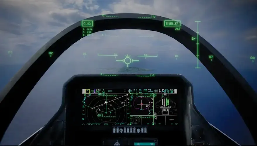
In army aerospace, a big design shift for the F-35 Lightning II was to remove many small physical switches and replace them with a large touch screen. Reviewing, a fighter pilot reported pressing the wrong part of the touch screen around 20% of the time during flights: “The drawback is in the complete lack of tactile response. It can be challenging to press the correct ‘button’ on the display whenever the jet is in motion as it is quite a bumpy ride at times.”
Back in 2019, the US Navy ditched touch screen ship controls, because the displays were complex and difficult to control in emergencies. “Unfamiliarity with the touch screens contributed to two accidents that caused the deaths of 17 sailors.”
The correction
Fortunately, there are signs that common sense is returning.
The Chinese MIIT (Ministry of Industry and Information Technology) intends to require physical control mechanisms for some functions.
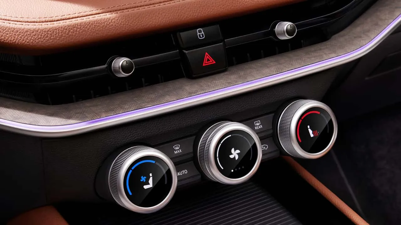
Skoda is doing well bringing back buttons.
The car safety testing organisation Euro NCAP said carmakers will need to bring back buttons for new car models tested from 2026 onwards to be able to receive a five-star rating.
Ferrari’s newly designed car interface is mainly focused on physical buttons. The designer Jony Ive understands where the product lives.
Jony Ive, in an interview with Top GearPractically and functionally, a large touchscreen doesn’t work in a car. That’s incontrovertible. I find it easy and lazy.
The car industry is slowly course-correcting. Let it be an example for the others.
Stop making everything a touch screen.
Design with the context in mind. Start making things that work where they live.