Revamping search: making migration worth it
Case study in 2021 - 2022 by Max van IJsselmuiden
Transform search from migration liability into platform proof-of-value
Restored user confidence and established interaction patterns that influenced the rest of the Suite
Lead UX Designer
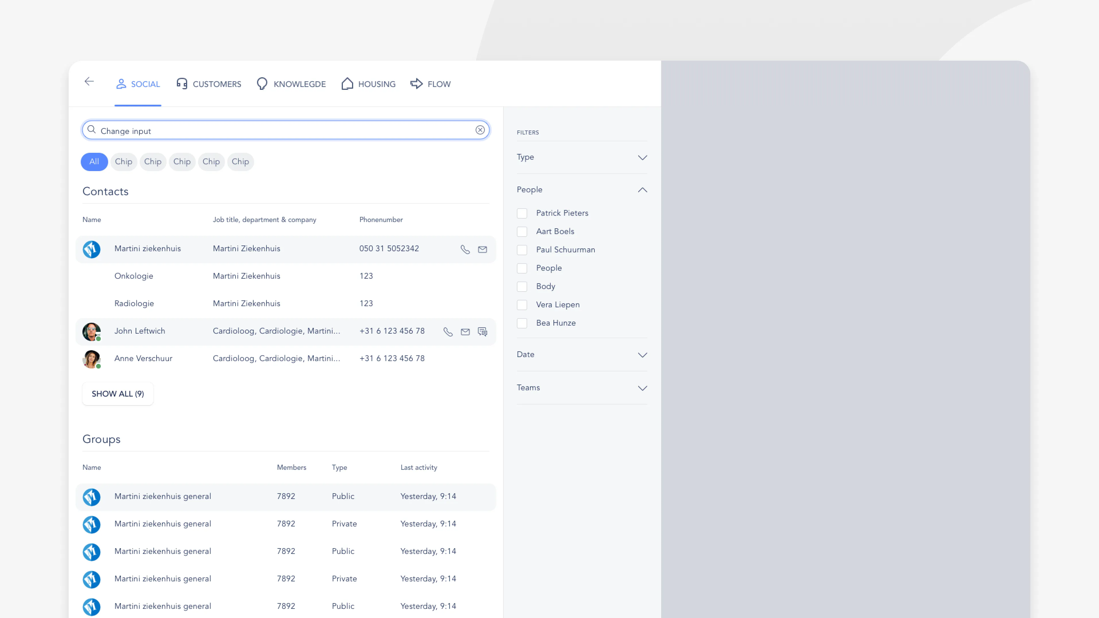
At Embrace - The Human Cloud, we were working on a Suite platform that combined different software products into a single SaaS package. Each of these products had their own data to search with varying use cases. For the two biggest products (Social: a social intranet, Customers: housing corporation CRM) the use cases were most important. In Customers search is the very first interaction that takes place for users to start their workflow.
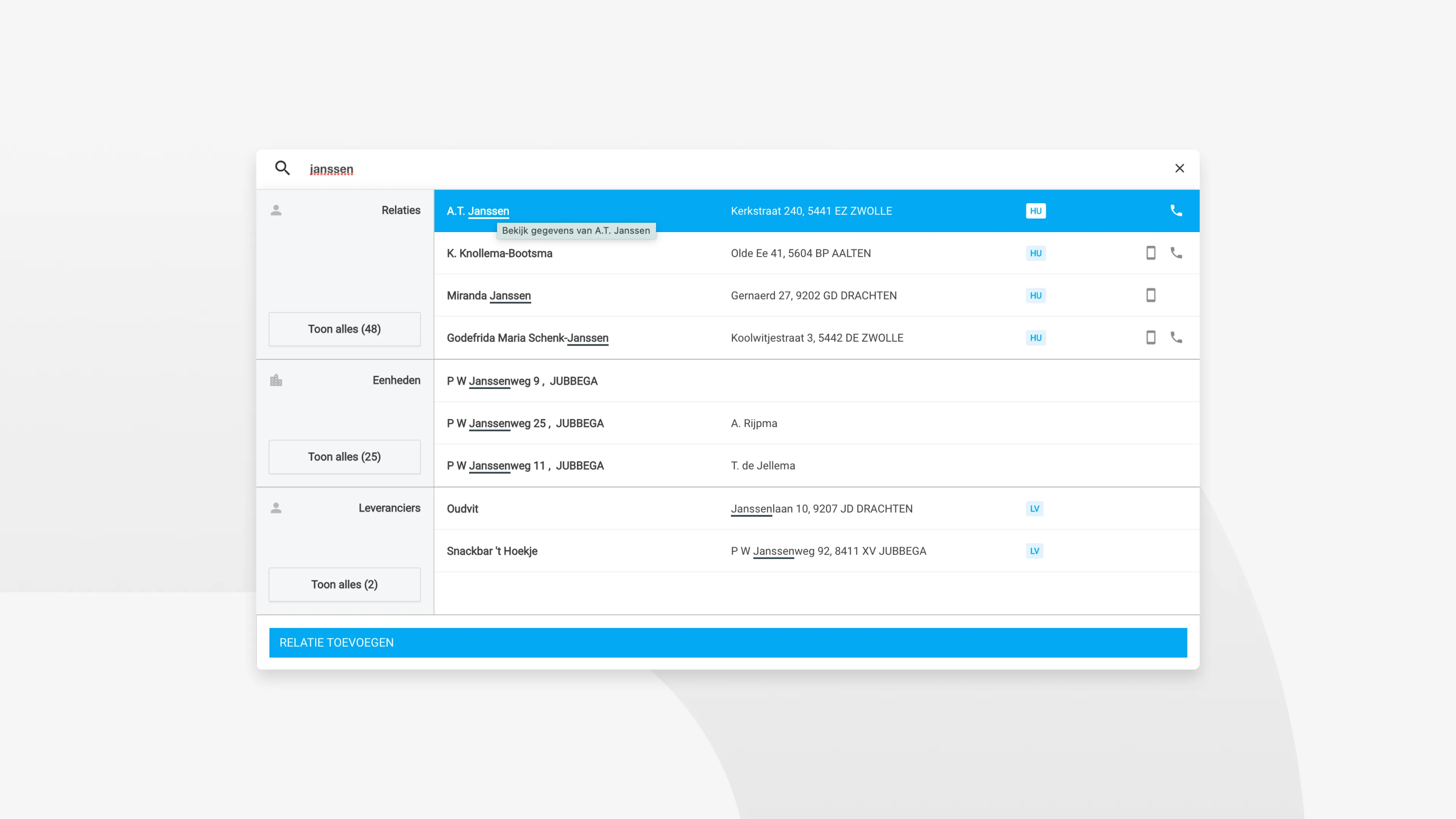
Customers users often were used to working with Umbrella. Umbrella’s search functionality actually turned out to have some positives, compared to the search that was in the Suite. In other words, a migration path to the Suite with a downside.
The platform migration was creating more problems than it solved. Users moving from the familiar Umbrella system to our new Suite found themselves struggling with basic tasks they’d mastered years ago. Search, their most critical daily tool, had become buried in slide-out panels with complaints mounting.
Discovery: Understanding the real problem
This wasn’t about competing with other platforms. Users were comparing everything to what they’d lost. The legacy Umbrella system had functional search with predictable layouts and consistent results. Our new Suite search felt like a clear regression.
The slide-out search pattern had fundamental usability issues. Each poor search experience reinforced doubt about the entire platform migration decision.
The challenge became strategic. We needed to create an experience that would demonstrate Suite’s superiority over the legacy system.
Strategy: The universal search vision
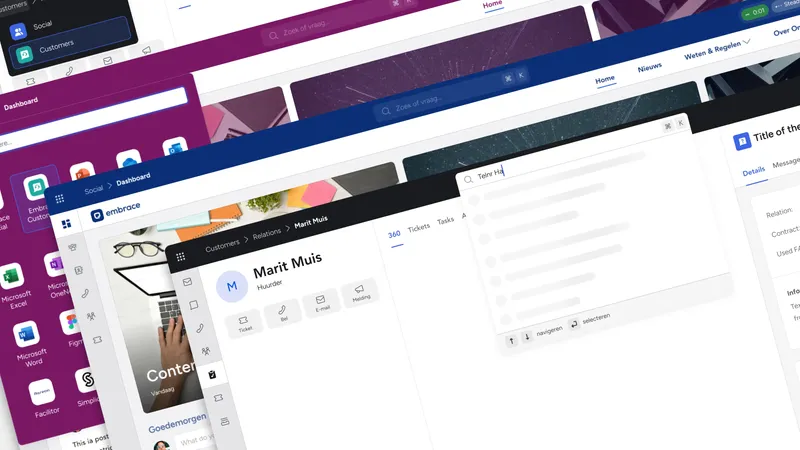
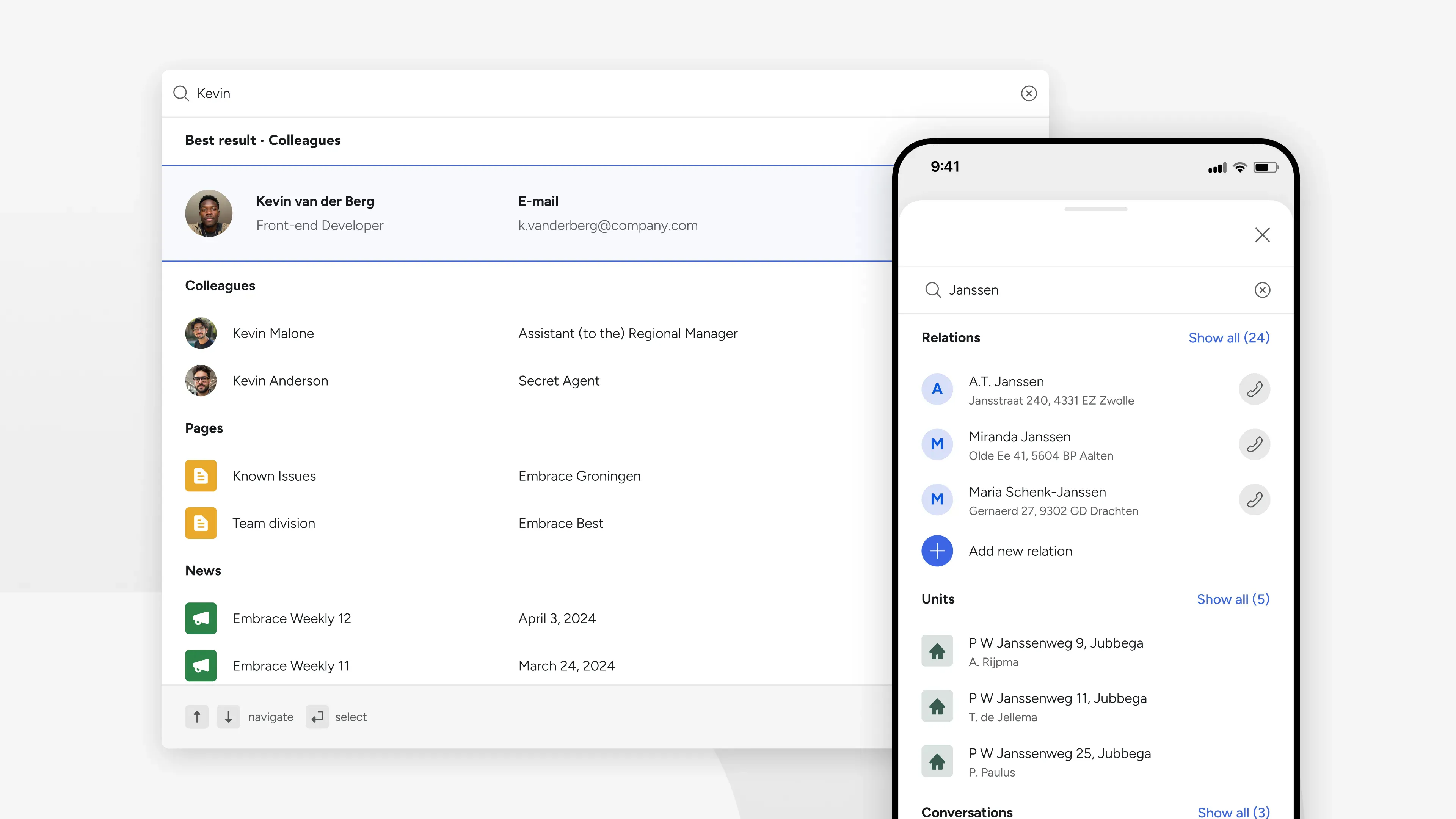
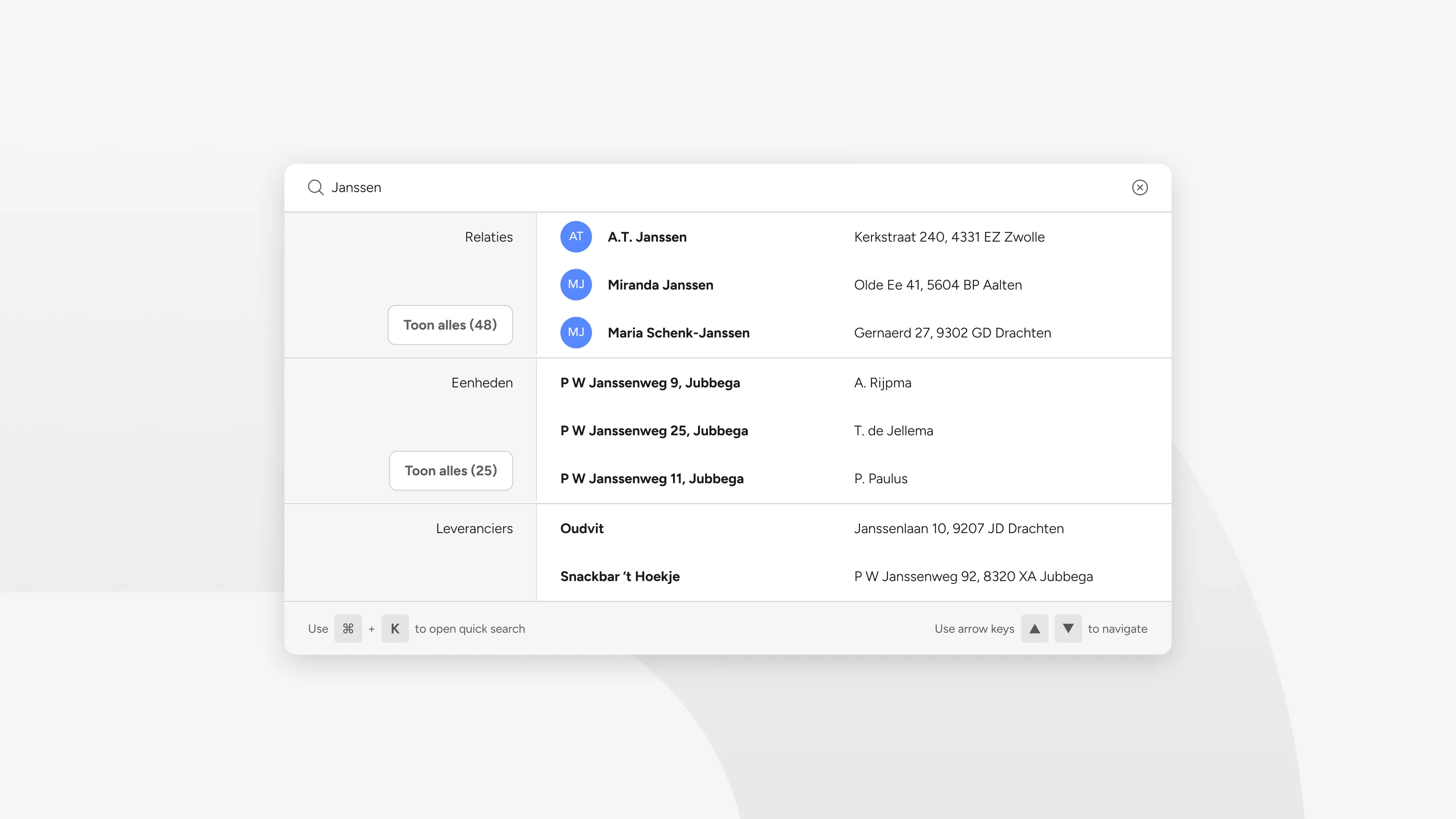
Drawing inspiration from system-level search patterns like macOS Spotlight, I proposed a keyboard-first overlay that would make finding anything instantaneous. We called this “quick search”: one search field to access all entity types across the entire Suite platform.
This approach solved multiple problems simultaneously. The overlay pattern worked consistently across devices. Keyboard shortcuts appealed to power users who needed speed. Most importantly, the simplicity and consistency in the layout of the searchable content demonstrated advantages over the fragmented legacy system.
Working with the CTO and product owners across all modules, we established the technical foundation for cross-platform entity indexing.
Design: Progressive disclosure strategy
The legacy system assumed users needed filters before searching. Our Elasticsearch infrastructure could handle broader queries intelligently, so I inverted this assumption.
- Progressive disclosure: 99% of searches satisfied without advanced filtering
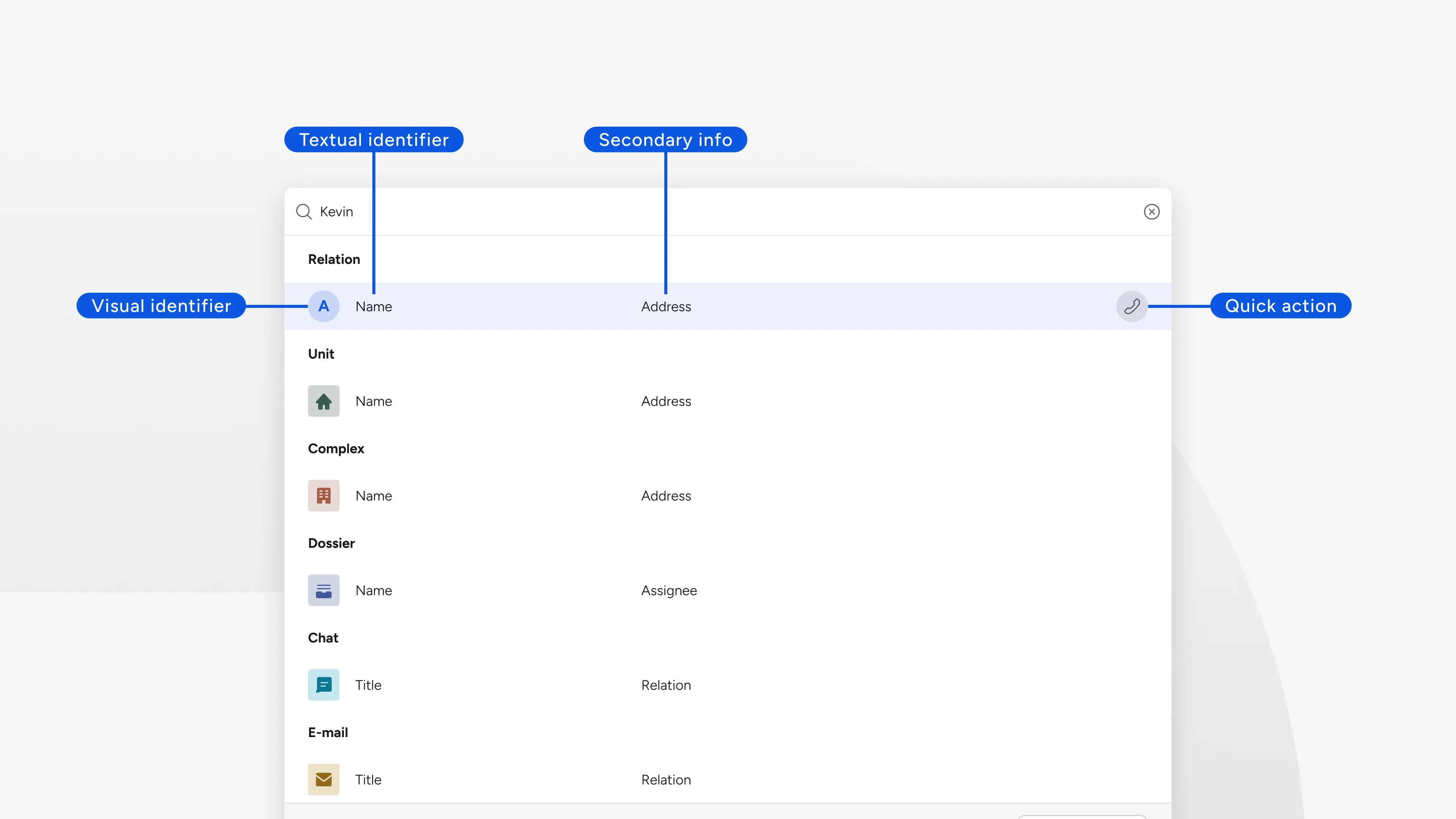
- Entity-specific quick actions: 1-2 primary actions per type
- Entity categorization: Color and icon recognition for different entity types
The most strategic decision was the quick vs. advanced search split. Rather than leading users through complex filters, the new architecture would show the best results immediately. Advanced search with filters would only be needed when quick search failed. This optimized the entire experience for that 99% use case.
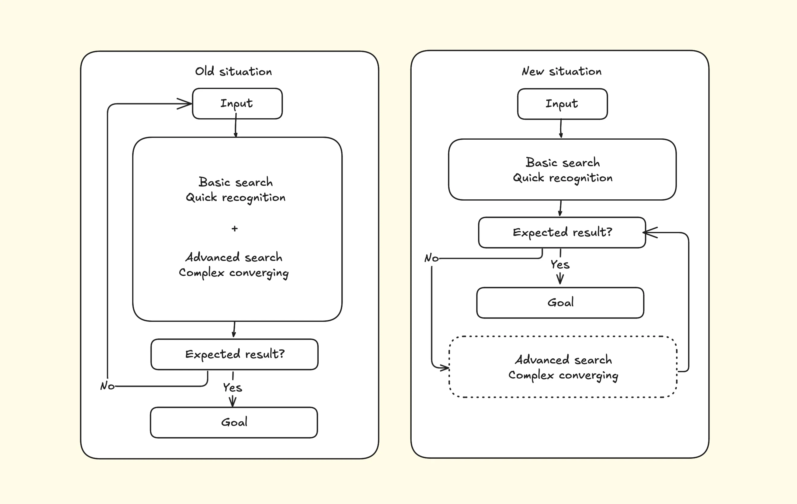
As illustrated in the diagram above, the old situation forced users to use both the more complex task (converging results, filtering) as the more simple task (recognizing whether the result is the expected result). Assuming the basic search functionality is working properly by relying on a successful algorithm, most users will avoid the more complex task in the new situation.
I designed a faceted system grouping results by entity type, each showing the three (sometimes two, depending on the category) most relevant results. Users could expand categories when needed, but the interface prioritized speed over completeness. Entries are quickly identified with visual recognition of both icon and colour, focusing on the ‘recognition over recall’ principle.
Validation: Learning through iteration
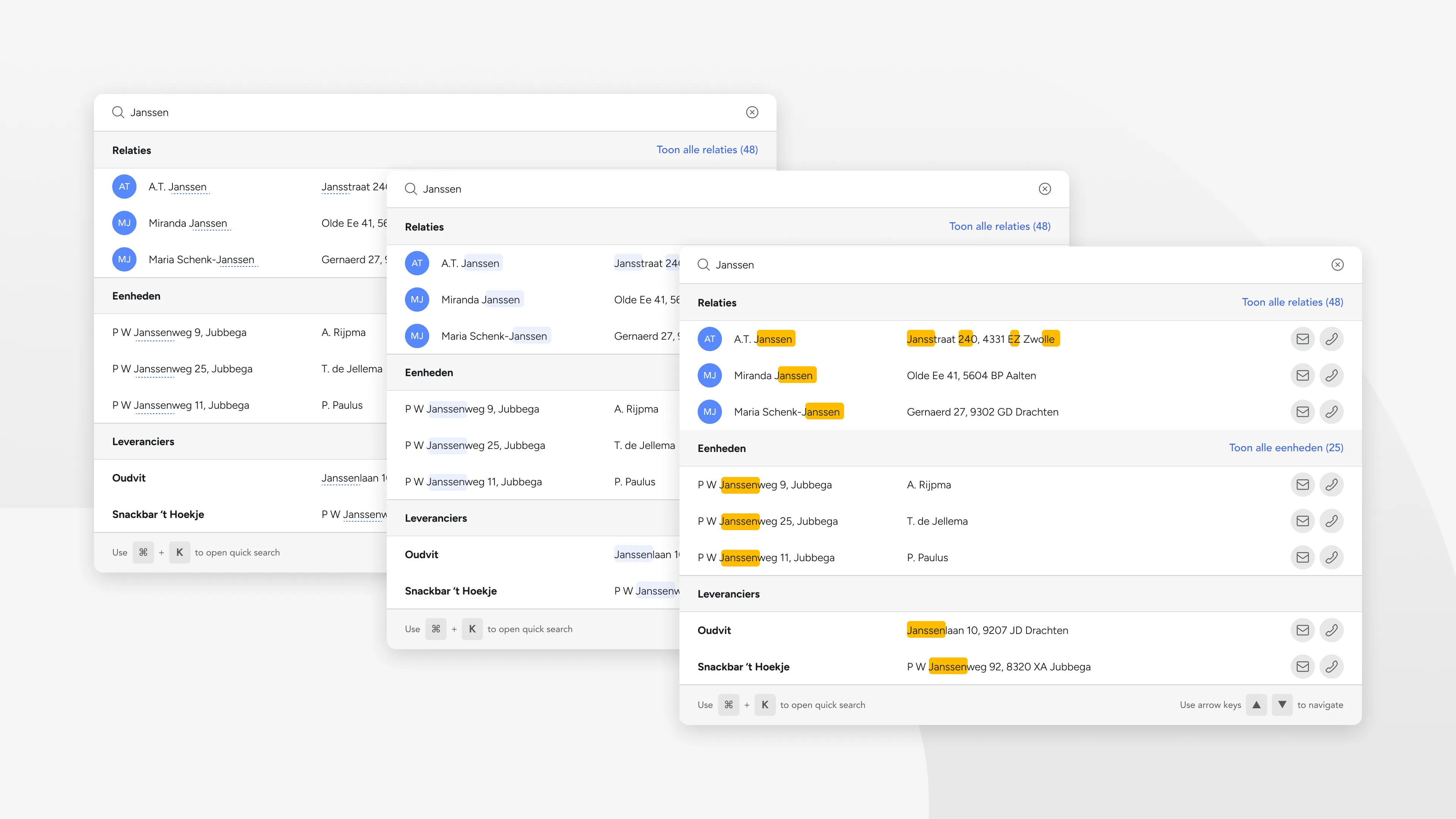
During stakeholder reviews and internal testing, one interaction needed refinement. Initially, “Show all” links only appeared when users hovered over each category, creating clean visual hierarchy. This was an aggressive decision from my side, supported by the strategy: only sending users to the ‘advanced search’ part when absolutely necessary.
I was aware of the risk. Users immediately reported this as buggy behavior. The hidden affordance felt broken rather than refined. We changed to always-visible links with result counts, making the information architecture transparent.
This reinforced that “in enterprise software, predictability trumps sophistication.”
Implementation: Building for the future
The search redesign became a catalyst for broader platform improvements. Through close developer collaboration and implementation oversight, we built a foundation that extended beyond search functionality.
- Search pattern influenced other Suite features
- Foundation built for future AI integration
- Established keyboard-first interaction standards
Post-launch feedback revealed that users had stopped comparing the Suite unfavorably to Umbrella. Search became their primary platform entry point, demonstrating the integration benefits that justified the migration investment.
The design proved that thoughtful platform migration could exceed user expectations while building toward future capabilities.
I’m still very much proud of this project. The interaction works like a charm, and I enjoy using it myself on a daily basis. It’s a great feeling, when design decisions lead to a better product and you get to experience it.