THX App: reinventing the onboarding experience
Case study in 2023 - 2024 by Max van IJsselmuiden
Users abandoned the app before experiencing core functionality, stuck behind ten data requests and a 135-second time-to-dashboard
Reduced initial data requests by 70% while improving engagement through gamification and conversational design
Lead UX Designer
THX is a community-driven market research platform that rewards users for sharing their opinions and media consumption data.
The app operates on a simple value exchange: users earn THX points by completing short surveys about brands, advertisements, and entertainment, or by allowing the app to passively measure their TV, radio, and outdoor media exposure.
These points can then be exchanged for gift cards, prize draws, or charitable donations.
This model creates a mutually beneficial ecosystem where users are compensated for their data and attention while market research companies gain access to authentic consumer insights and media consumption patterns.
The challenge, however, was that users were abandoning the app before understanding this value proposition.

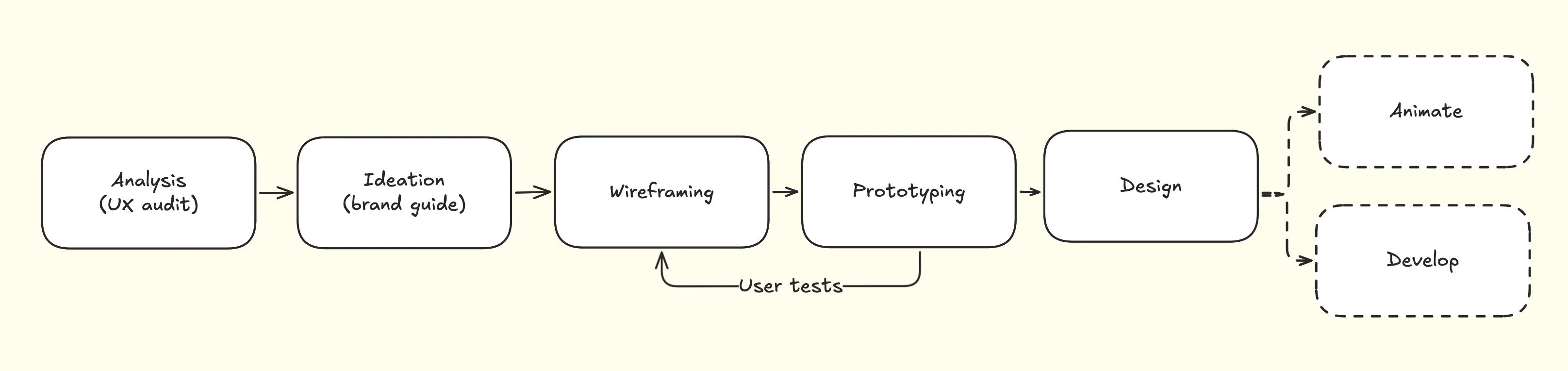
The THX app redesign followed a systematic design process. The project moved through five core phases: analysis through comprehensive UX auditing, ideation, wireframing of improved user flows, prototyping for testing validation, and finally high-fidelity design creation.
User testing provided crucial feedback that shaped iterative improvements, creating a feedback loop that ensured solutions addressed real user needs.
The challenge
The THX app faced a critical user retention crisis. Users were abandoning the app before experiencing the core value, creating a leak in the conversion funnel that made user acquisition expensive and ineffective.
The onboarding process had evolved into a complicated obstacle course requiring users to complete ten different ‘data requests’ before reaching the dashboard.
This resulted in a time-to-dashboard of 135 seconds that was considerably longer than competitors.
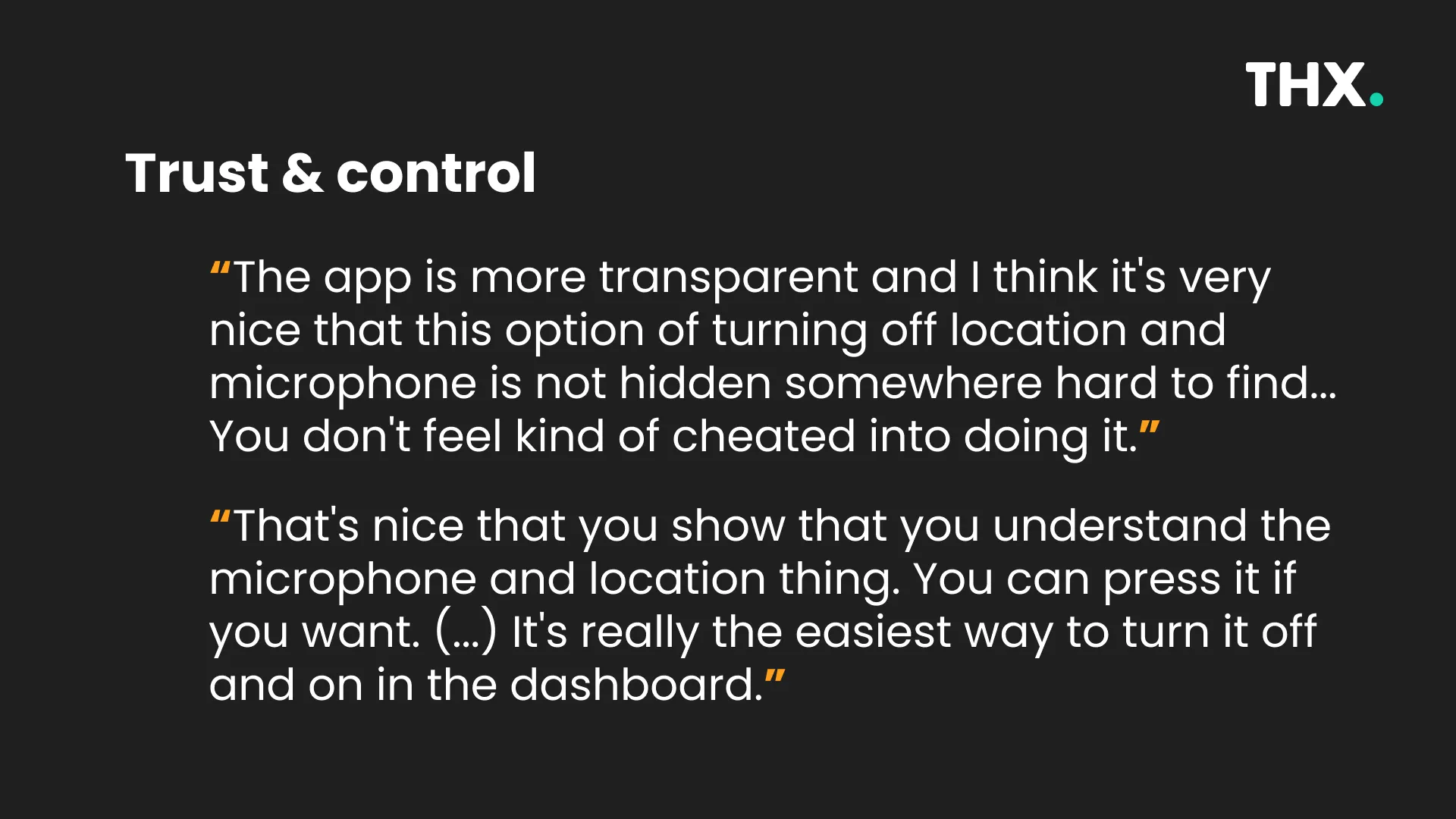
The permission request strategy compounded these problems by interrupting users directly, asking for system access before establishing trust or demonstrating the value of sharing their data.
Users found themselves overwhelmed by dense information without clear explanation of how the reward system worked or why they should invest their time.
The lack of ‘skip’ or ‘complete later’ functionality for non-essential requests ignored the diverse motivations users might have for joining a market research platform.

Initial audit
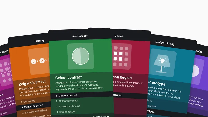
The project began in early 2024 with a comprehensive UX audit that applied Jakob Nielsen’s ten usability heuristics as a systematic framework for identifying specific usability issues.
This methodical approach revealed problems that went deeper than surface-level design issues, exposing fundamental flaws in how the app communicated with users and respected their autonomy.
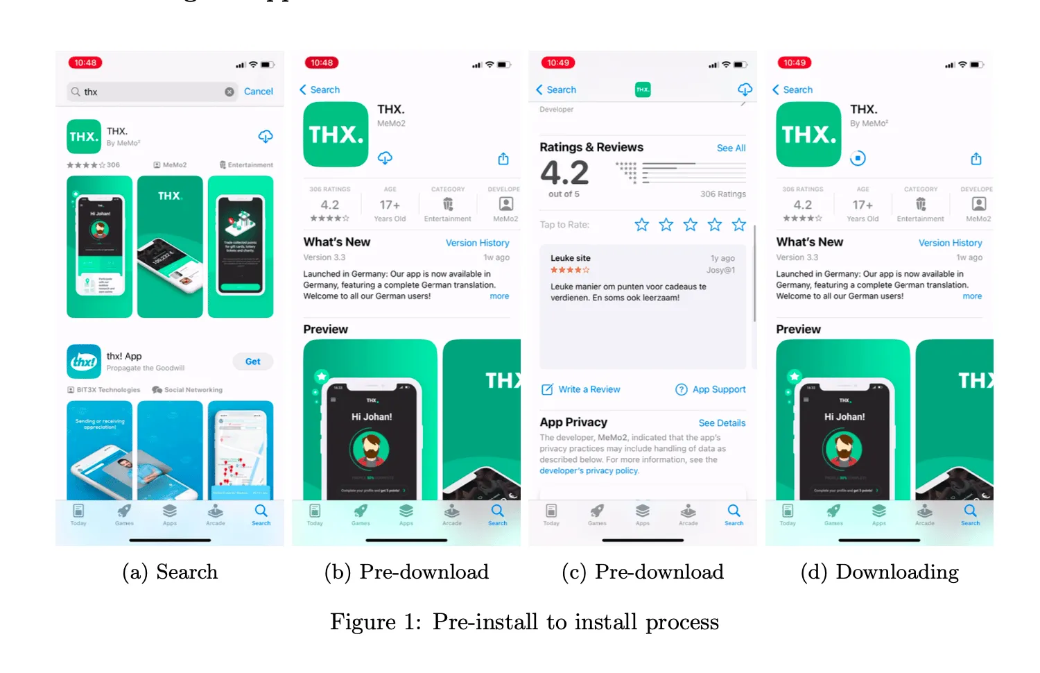
The audit process involved detailed analysis of every step in the onboarding journey, from app store discovery through first dashboard access.
I documented user flows, measured completion times, and compared the THX experience against competitor apps like Jagger and behavioral patterns observed in successful apps like GentlerStreak.
The competitive analysis was particularly revealing, showing how other apps managed to build user engagement through clever gamification and clear value communication rather than information extraction.
Nielsen’s heuristics provided a structured lens for understanding why users were dropping off.
The app failed in visibility of system status by providing no progress indicators during the lengthy setup process, leaving users uncertain about how much more information they’d need to provide before accessing the reward-earning features.
It violated user control and freedom by making every step mandatory, preventing users from prioritizing the features most relevant to their interests.
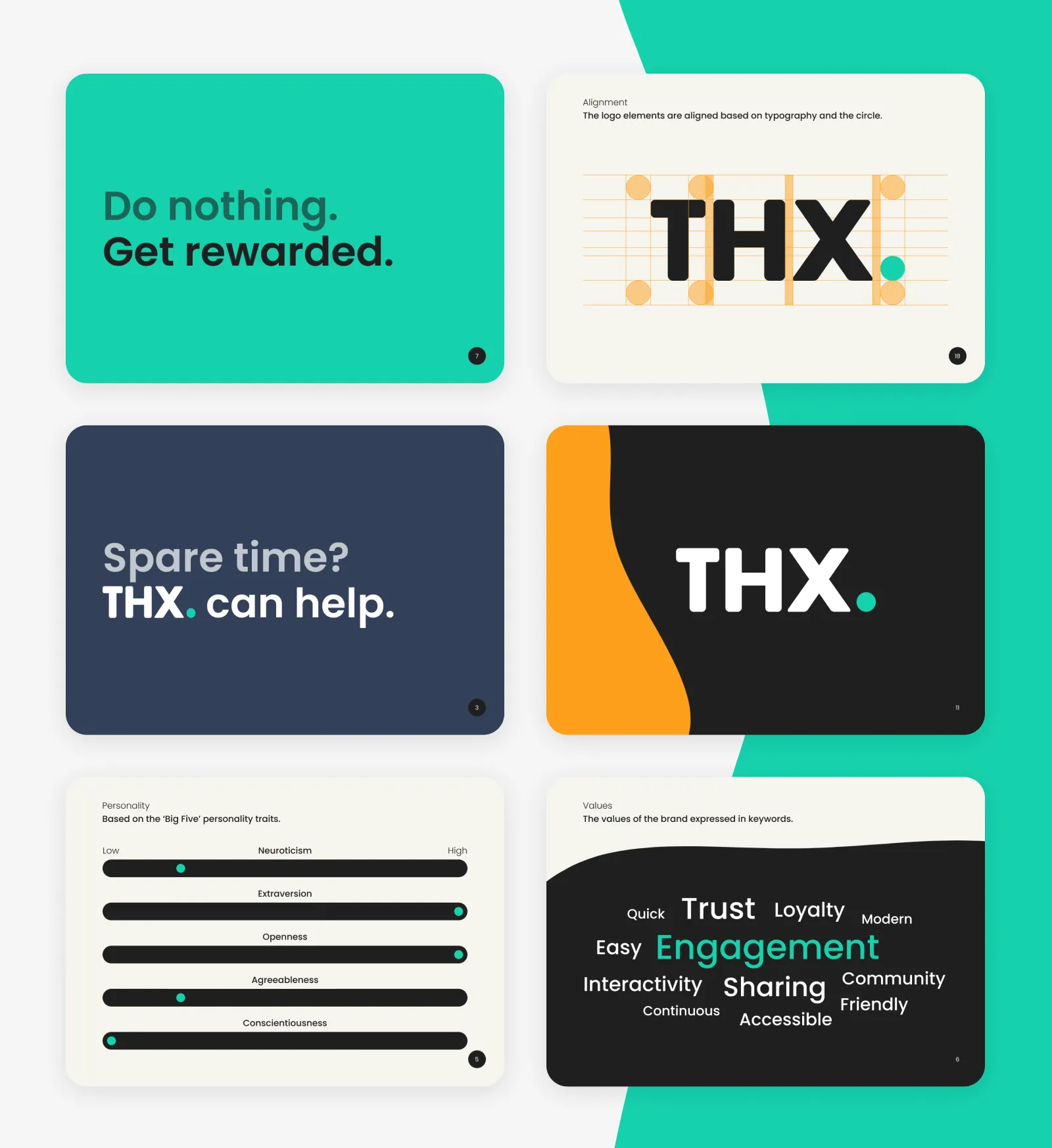
Building brand foundation
With a clear understanding of the usability problems, the next phase focused on establishing a stronger brand foundation that could support better user experiences.
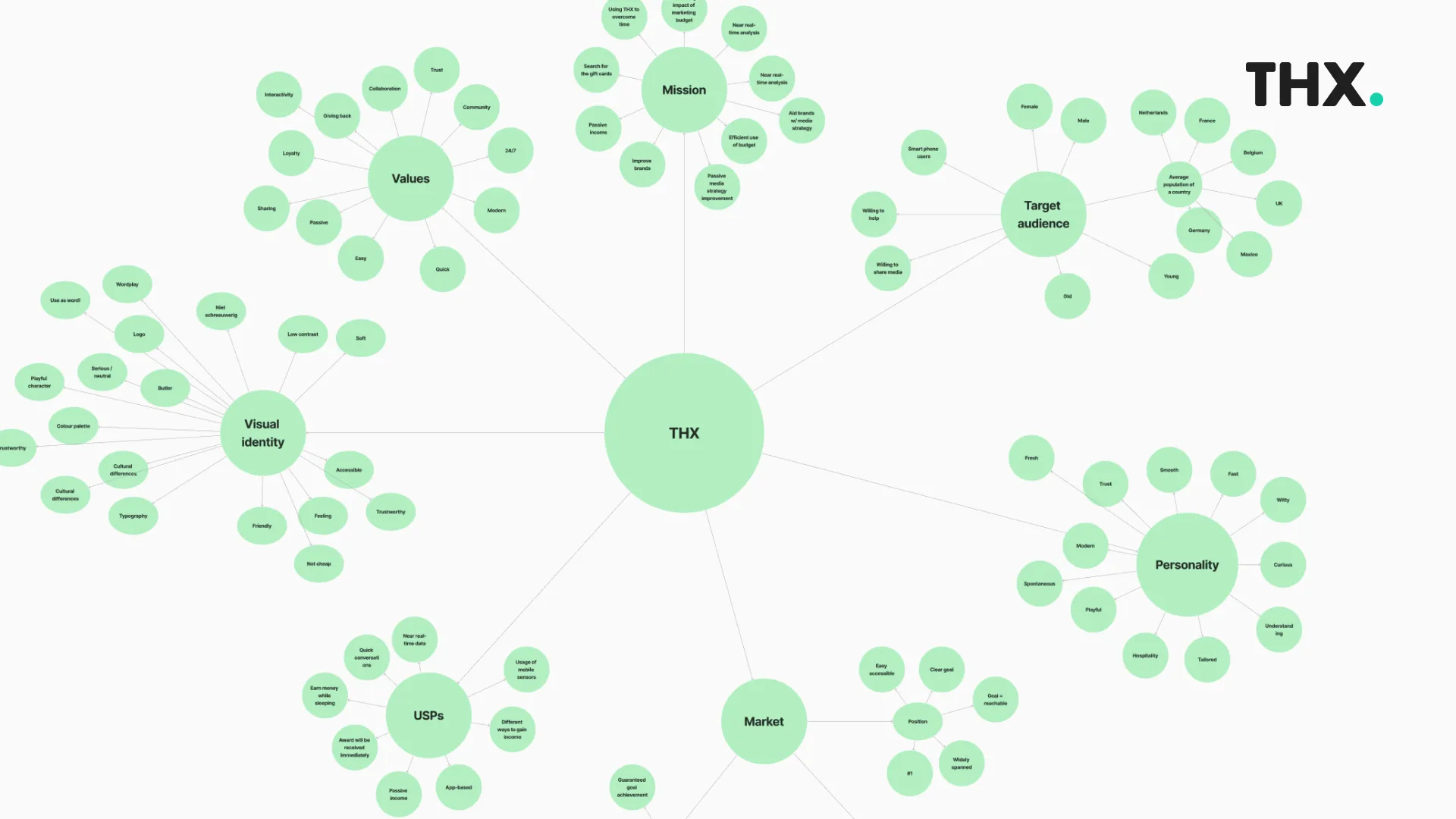
I organized collaborative workshops with stakeholders to define the THX brand personality and assess its core values.
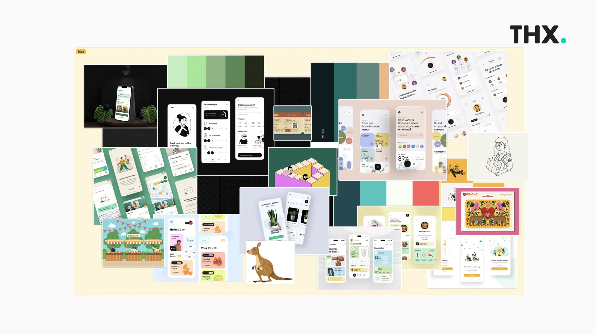
The brand guide development process involved exploring visual languages that would better match user expectations while maintaining the professional credibility required for a market research platform.
Through iterative exploration (mind mapping, brainstorming), I developed a lighter, more accessible aesthetic that could build trust through familiarity while maintaining the premium quality associations important to the brand.
This foundational work proved crucial for the later design phases, providing clear principles for making design decisions and ensuring consistency.

Reimagining the onboarding
Rather than making incremental improvements, I reimagined how users should be welcomed into the THX community.
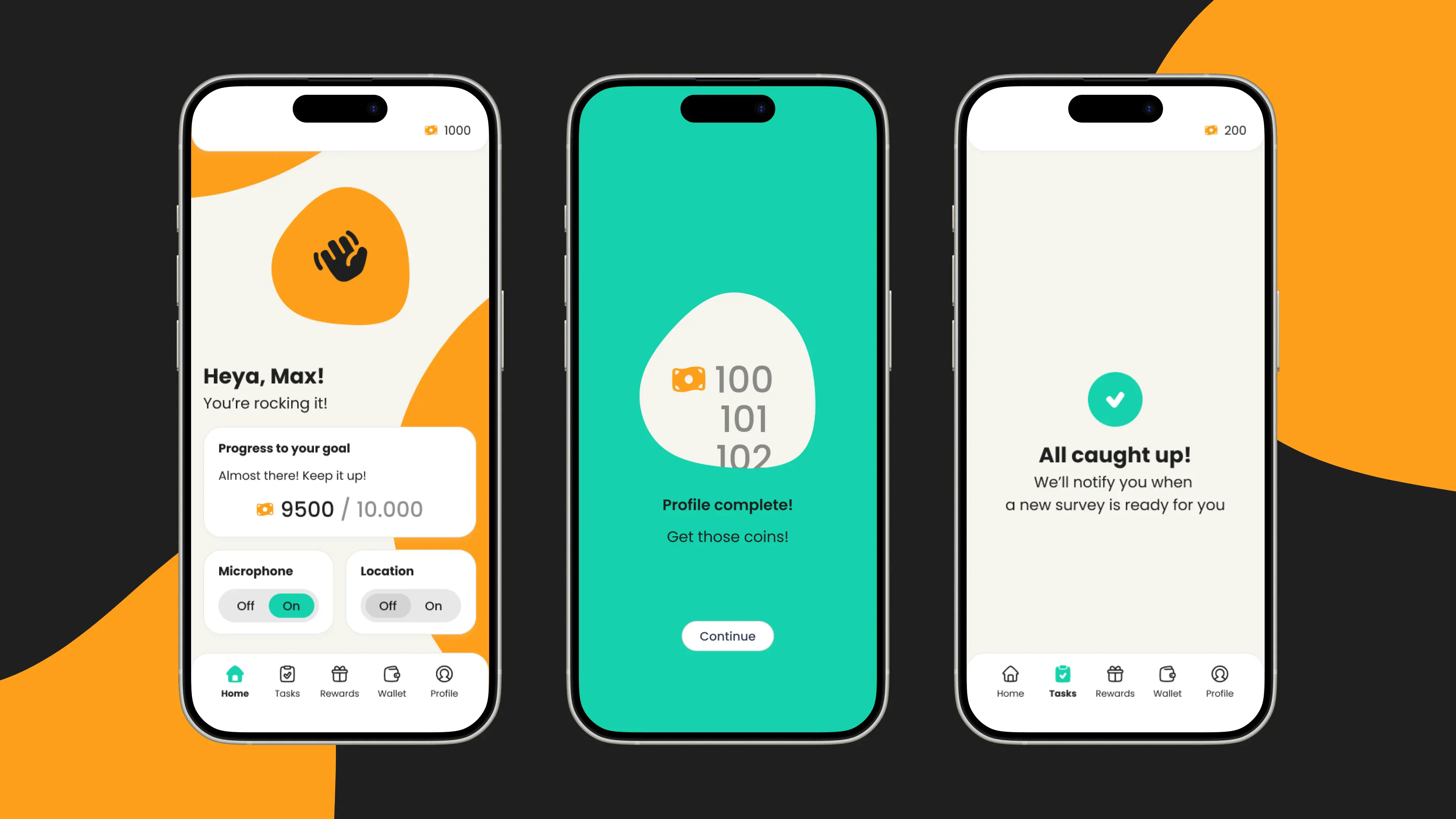
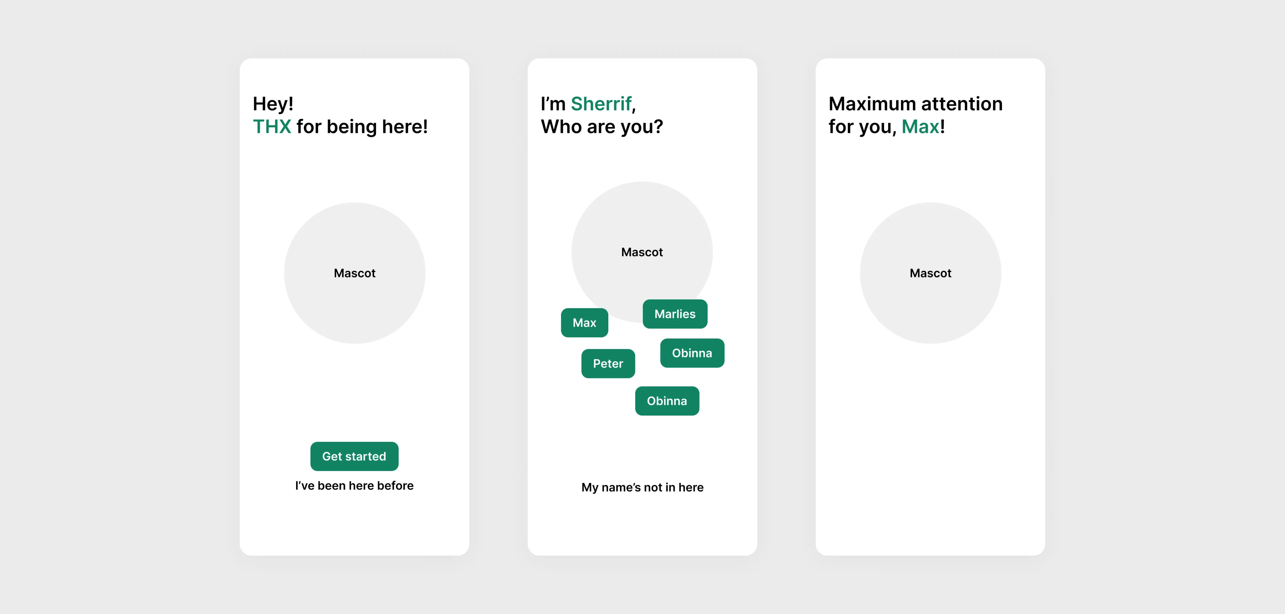
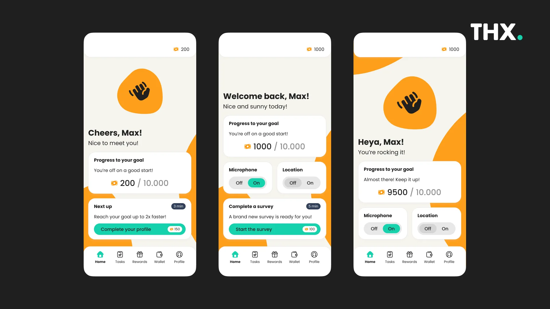
The solution centered around a conversational interface featuring an animated mascot that would guide users through onboarding with personality and warmth rather than corporate efficiency.
This conversational approach transformed onboarding from data collection into a personalized welcome experience.
The mascot would greet users by name and create moments of delight. These micro-interactions can establish trust and make the user feel at ease.
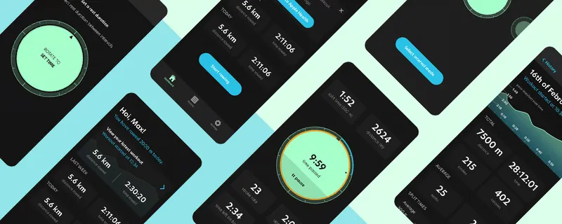
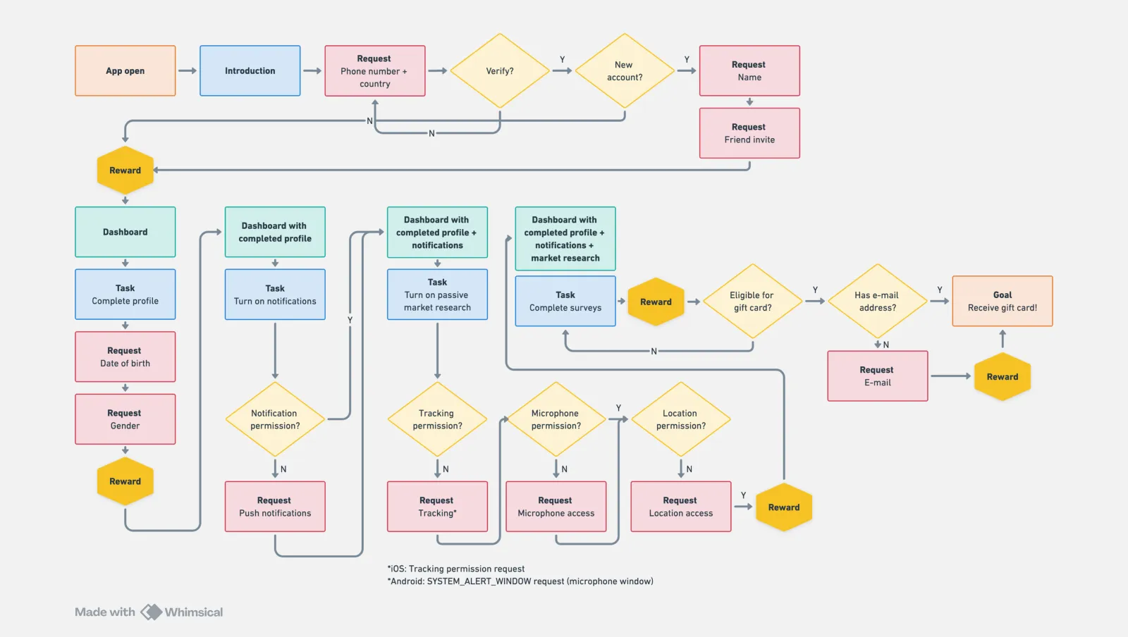
The redesign reduced initial data requests from ten to three essential elements: name for personalization, phone number and country for account creation, and friend invite for community building.
These formed the minimum foundation needed for a personalized experience, with all other data collection moved to optional tasks users could complete later.
User testing with 5-7 participants revealed that while users appreciated the conversational tone, they still felt uncertain about the value they’d receive.
This led to a gamification approach where we turned system permission requests into rewarded experiences.
Rather than confronting users with sudden permission prompts, the app would first explain what each permission enabled through animated slides, building understanding.
Bringing wireframes to life
The wireframing phase translated these conversational concepts into detailed interaction designs that could accommodate both the animated character and the streamlined information requests.
Skip functionality was designed into non-essential steps, with the mascot explaining why certain information was optional while still encouraging completion for better survey targeting.
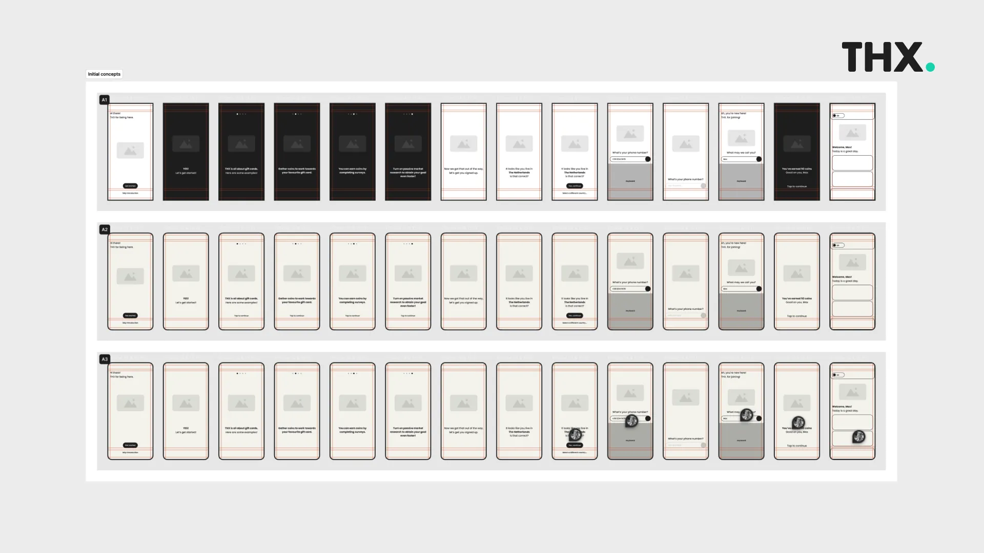
Dashboard variations
Think-aloud testing
The first round of user testing took place in Groningen with 5-7 participants using think-aloud protocols that captured users’ real-time reactions to the adjusted onboarding flow.
The think-aloud sessions revealed several important insights about the character-driven approach.
Users responded remarkably positively to the personalized puns and conversational tone, with many commenting that the app felt friendlier and more trustworthy.
The permission explanation slides successfully reduced anxiety around data sharing, although this still left room for improvements.
Lessons learned
The THX app redesign demonstrates how systematic UX research can identify the root causes of user experience problems and guide the development of solutions that address both functional and emotional user needs.
The project reduced initial data requests by 70% while actually improving the app’s ability to build user engagement through strategic gamification.
The iterative approach of audit, design, test, and refine proved essential for creating solutions that worked.
User testing revealed insights that couldn’t have been predicted, and the think-aloud methodology provided rich qualitative data that informed design decisions throughout the process.
The project showed how onboarding design affects not just user conversion but user perception of the entire brand.
By transforming the initial experience, the redesigned onboarding sets the stage for ongoing user engagement and loyalty.
It was great fun to work with the challenge of building trust and understanding. Being honest and clear upfront to the user will always lead to better results.